Walk into a room painted entirely in bright red and your heart rate will increase within minutes. Step into a space washed in soft blue and your breathing slows. Colour is one of the most powerful and most underused tools in commercial interior design. Used well, it can energise a team, sharpen focus, or create a sense of calm. Used badly - or not at all - it creates environments that actively work against the people inside them.
How colour affects the brain
Colour psychology is not guesswork. Research from the University of British Columbia found that blue environments improve creative thinking, while red environments improve attention to detail. Green reduces anxiety and promotes balance. Warm tones like amber and terracotta stimulate social interaction and energy. Cool neutrals provide visual rest between zones of higher intensity.
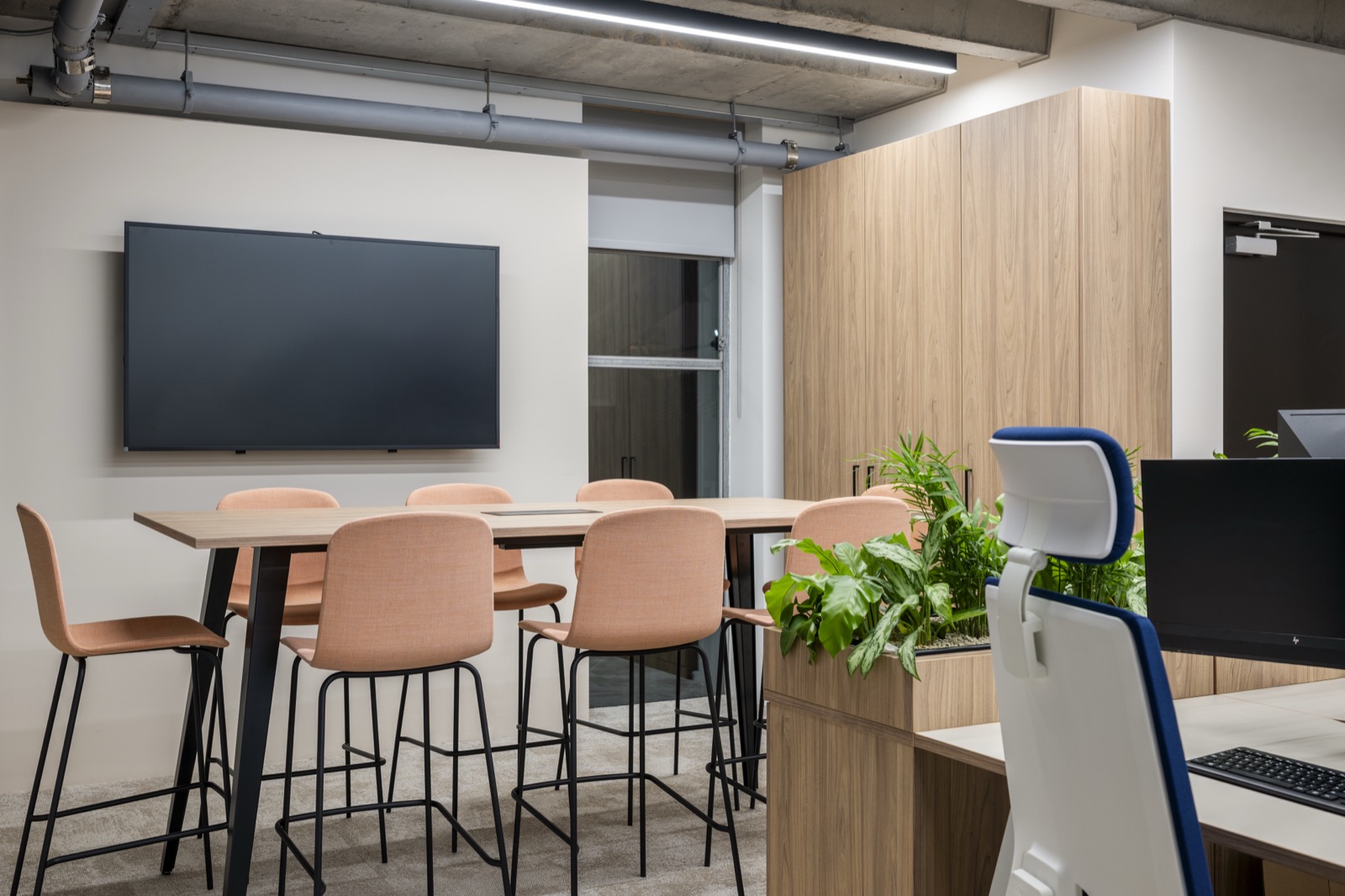
The challenge in office interior design is that a single workspace needs to support multiple activities. A focus zone needs different colour cues to a breakout area. A client-facing reception should feel different to an internal collaboration hub. Colour is the fastest way to signal these transitions without relying on walls or partitions.
Strategic colour placement guides energy and focus throughout the workspace.
Colour strategy in practice
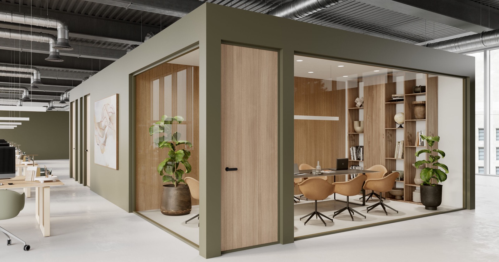
We always start with the client's brand palette, but we never let it dominate the entire scheme. A brand with bold primary colours might use those as accent moments - a feature wall, upholstery details, signage - while the broader environment stays neutral and calm. The goal is a space that feels on-brand without feeling like you are sitting inside a logo.
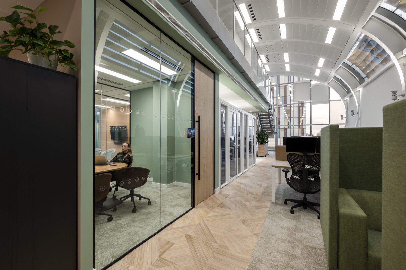
Zoning through colour is particularly effective in open plan environments. A deep teal in the quiet work area. Warm timber tones in the social kitchen. Clean whites and greys in the meeting rooms. These shifts do not need to be dramatic to be effective. Subtle changes in tone and material warmth are enough to guide behaviour without anyone consciously noticing.
Colour is not decoration. It is navigation. It tells people how a space wants to be used before they consciously register it.
Common mistakes to avoid
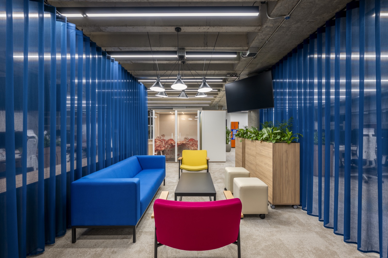
The biggest mistake we see is all-white offices. Businesses choose white because it feels safe and clean, but research consistently shows that stark white environments increase fatigue and reduce productivity. The second most common error is using too much of one colour. Even a calming blue becomes oppressive when it covers every surface. Variety and contrast are essential.
Colour should be considered from day one of a workspace design and build project, not added as an afterthought once the layout is fixed. It affects material selection, lighting design, furniture specification, and wayfinding. Get it right and the entire space feels cohesive. Get it wrong and no amount of good furniture will fix it. Browse our project portfolio to see colour strategy in action across a range of sectors.